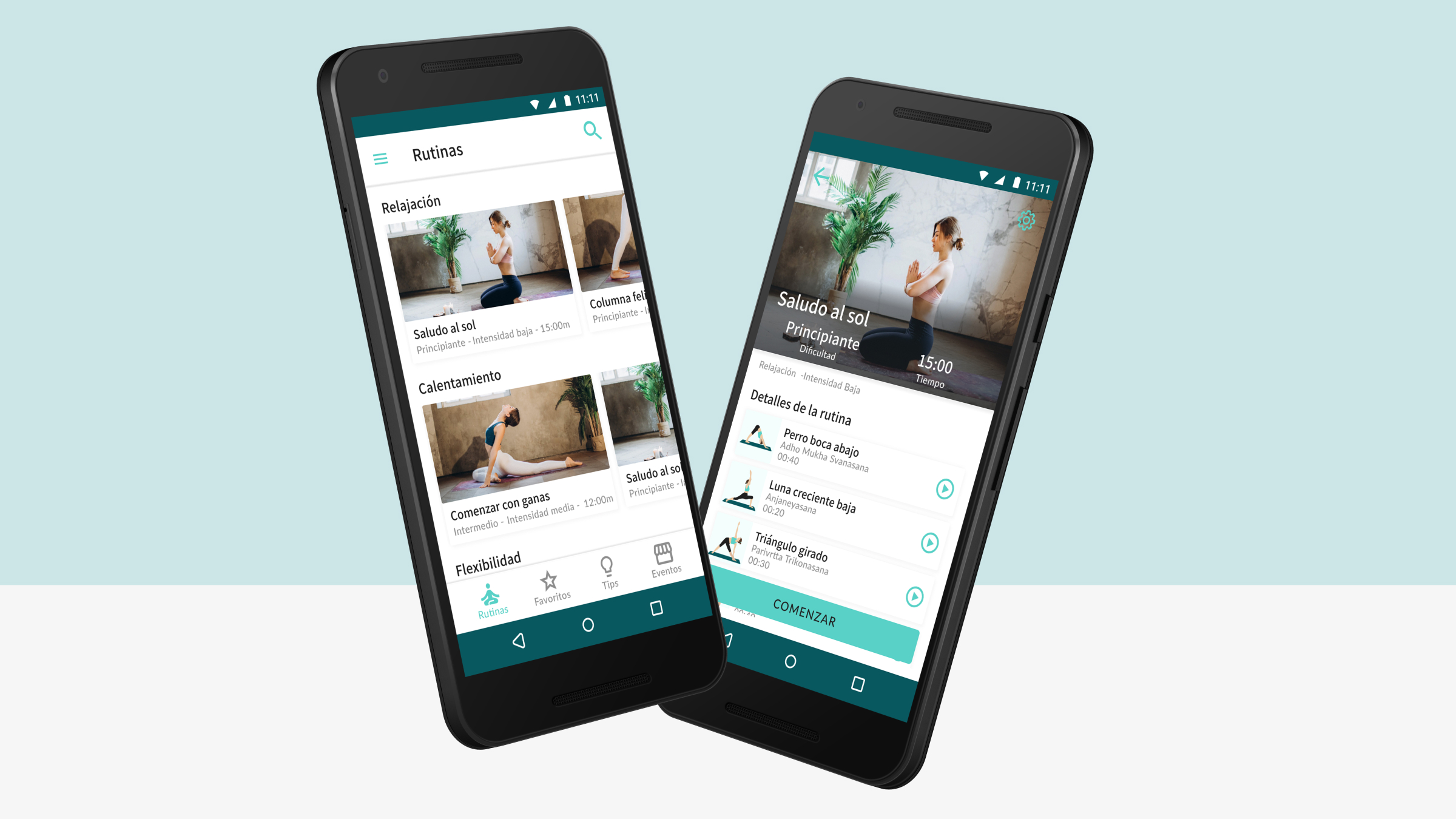
Yoggi - Android App
End-to-end UX process for a conceptual Android yoga platform.
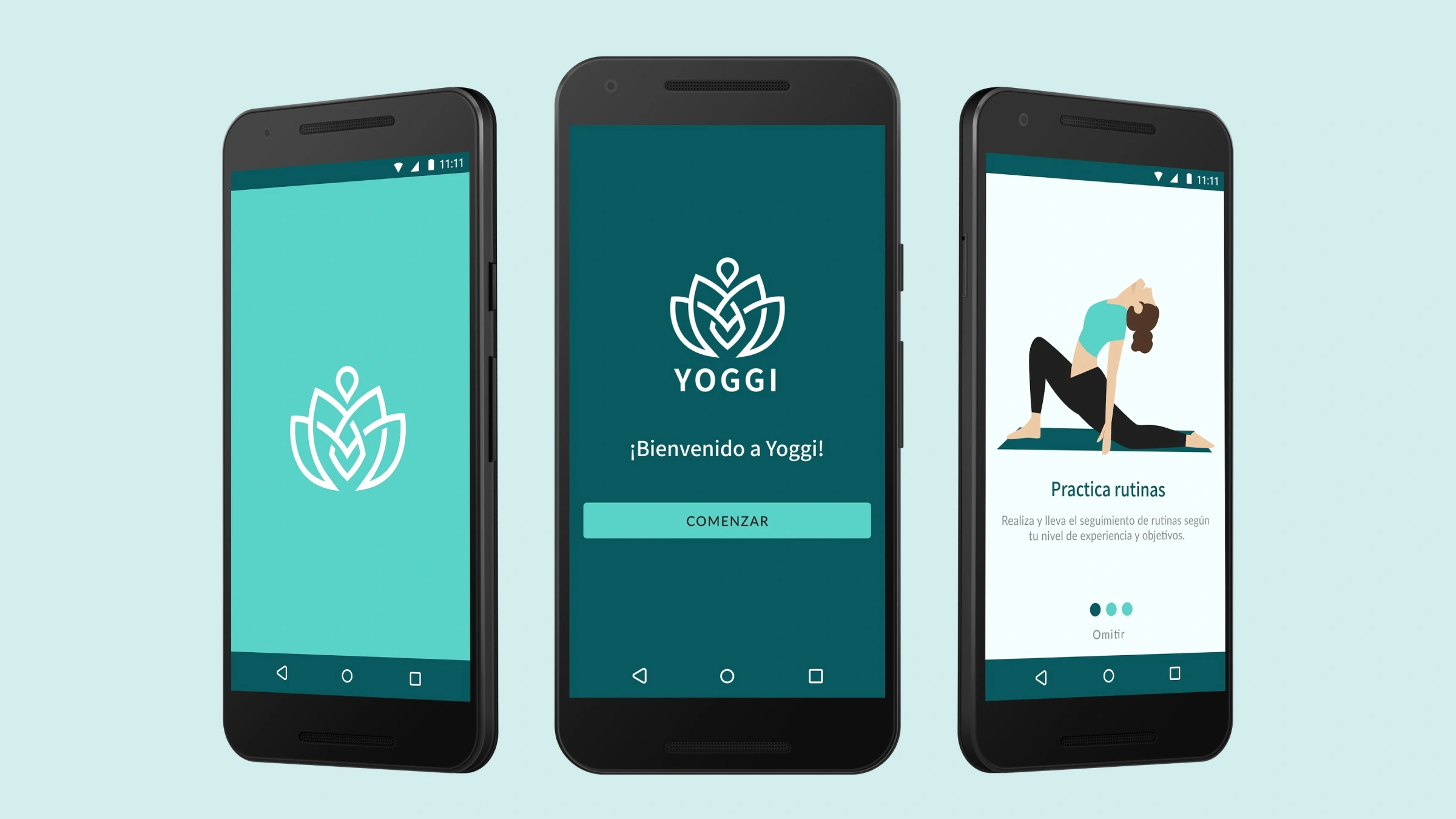
Yoggi is a conceptual native Android app for yoga enthusiasts, designed end-to-end as part of a UX certification in 2021.
Good content. Frustrating experiences.
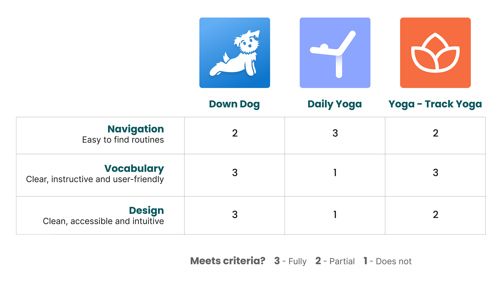
A competitive review of three leading yoga apps revealed consistent patterns: navigation was rarely intuitive, UX writing was often too technical for casual users, and accessible design was the exception rather than the rule. Most apps were also locked behind expensive subscriptions.
Those gaps shaped Yoggi's design principles from the start: clear language, accessible foundations, and navigation built around how users think about yoga, not how the industry categorizes it.
Understanding people before designing for them.
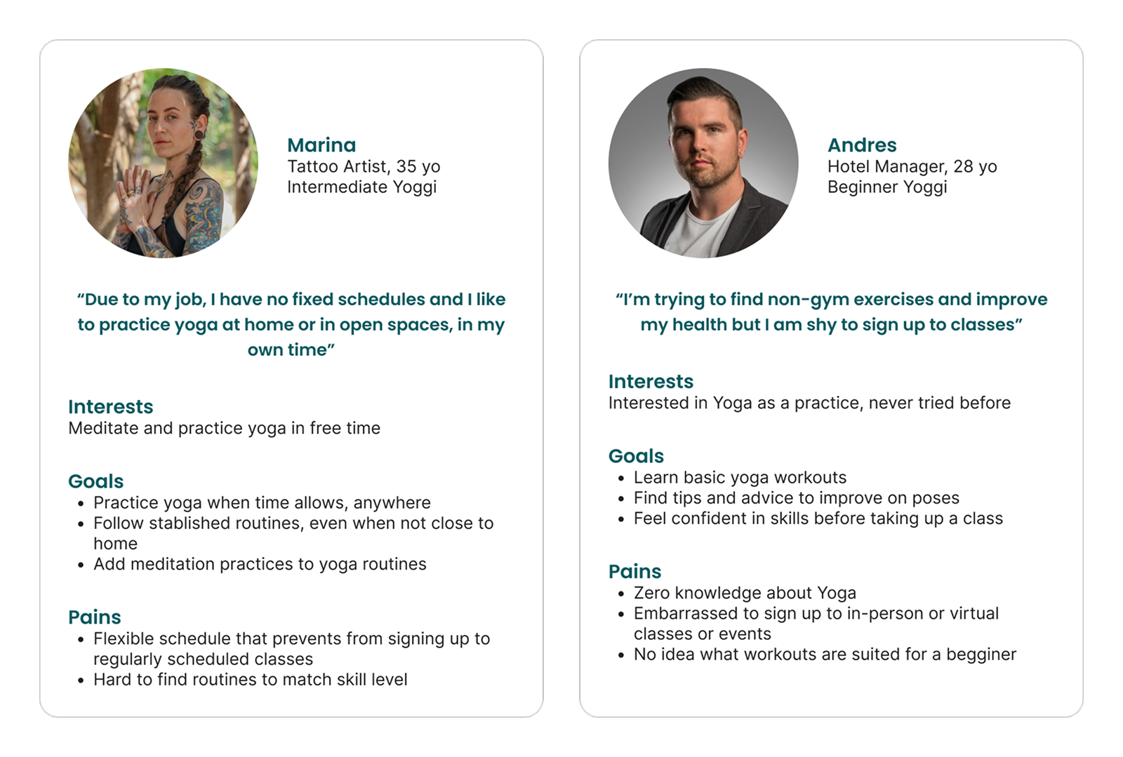
To understand what yoga practitioners actually needed from an app, I interviewed 10 to 15 practitioners, with and without digital tools. The goal was to hear how they described their practice before designing around it.
Alongside the interviews, I ran a cardsorting exercise asking participants to group and label yoga content in their own words. The results informed the information architecture, ensuring navigation reflected user mental models rather than assumed categories.
Together, the research revealed a clear user profile: someone with an existing practice looking for variety, guidance matched to their level, and ways to stay connected to the yoga community.
Events weren't in the original scope. They became one of Yoggi's three core features because the research demanded it.
Evidence beats assumptions.
Events weren't in the original scope. Card sorting showed 87% of participants grouping local events alongside core yoga content rather than as a separate category. Follow-up interviews confirmed the pattern: users wanted one place for guided practice and yoga events, online or in person.
That insight changed the product. The navigation was restructured, the information architecture reworked, and an events section added to the MVP.
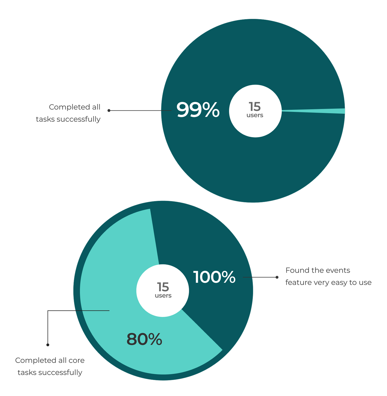
In usability testing, 100% of participants said they would use it.
Built systematically from the start.
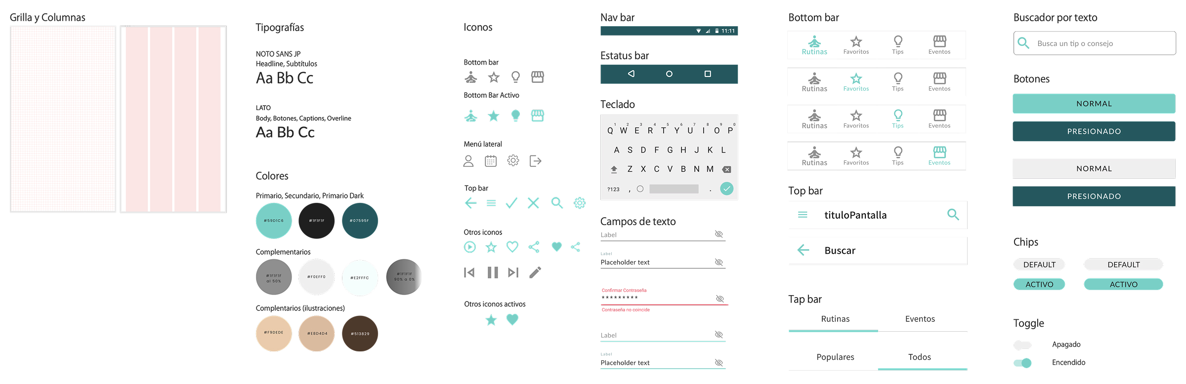
Yoggi's UI Kit followed Atomic Design principles, with Material Design guiding interaction patterns and Android conventions while leaving room for Yoggi's own visual identity.
Color tokens, typography, and layout foundations came first, with WCAG AA accessibility built in from the beginning. The library grew to around 50 components and icons, covering everything needed for the MVP.
15 participants. 5 tasks.
Usability testing ran with 15 participants across 5 core tasks. All successfully completed the main flows: logging in, finding a routine, browsing tips, and finding an event.
The events section was the clearest win. 100% of participants found a yoga event in an average of 2.8 steps. The biggest issue was saving a routine to favorites, where 2 out of 5 users struggled. Replacing multiple save buttons with a familiar star icon resolved the problem.
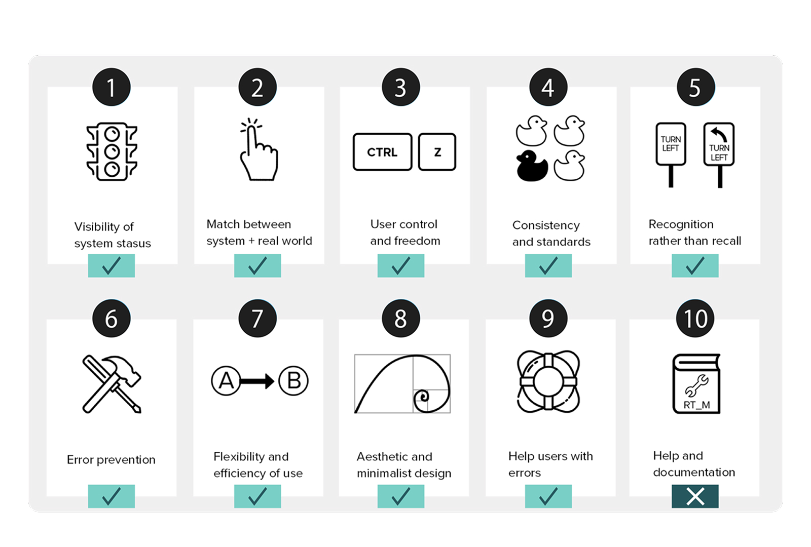
A self-conducted heuristic evaluation caught what testing didn't. It identified the need for a help screen and revealed that “Community” was a confusing label, leading to its rename as “Tips.”
The active workout screen is the most considered moment in the product.
The hi-fidelity prototype covers the full MVP: onboarding, routine discovery, workout playback, tips, and events. Every flow reflects the research findings, from navigation grounded in user mental models to the addition of the events experience.
The active workout screen is the centerpiece of the product, combining pose illustrations, a timer, and step controls to guide users without overwhelming them. The post-workout flow closes the experience with a quick rating and an immediate path to another routine.
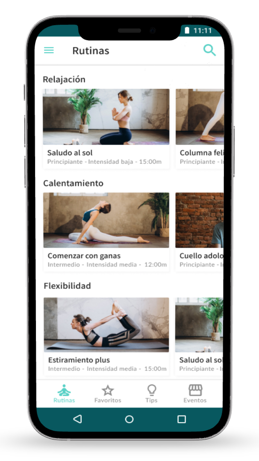
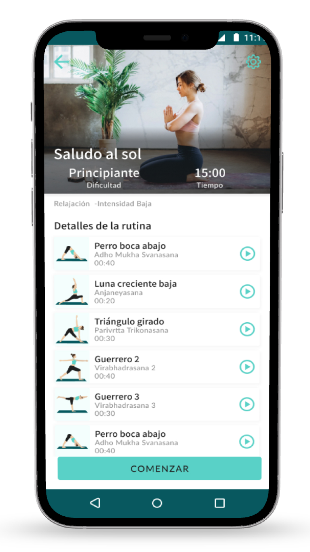
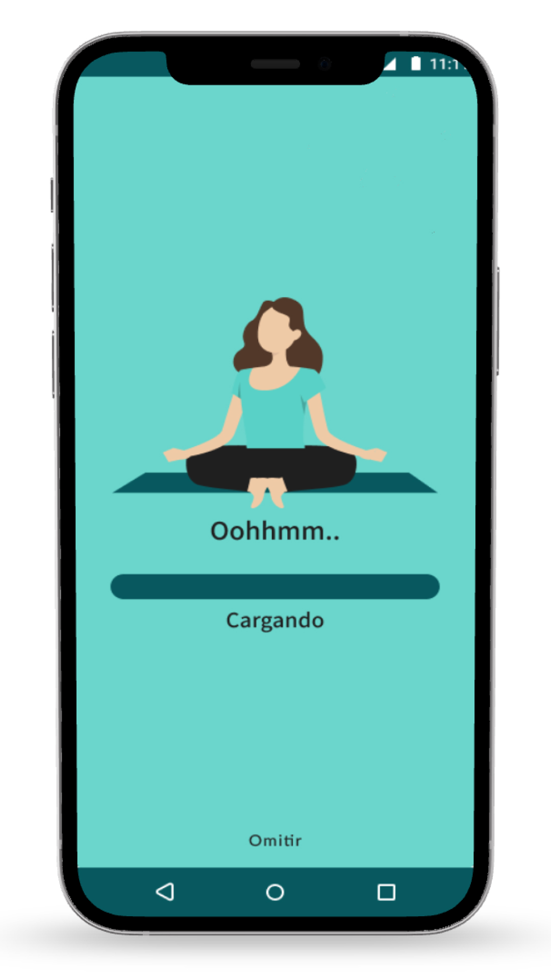
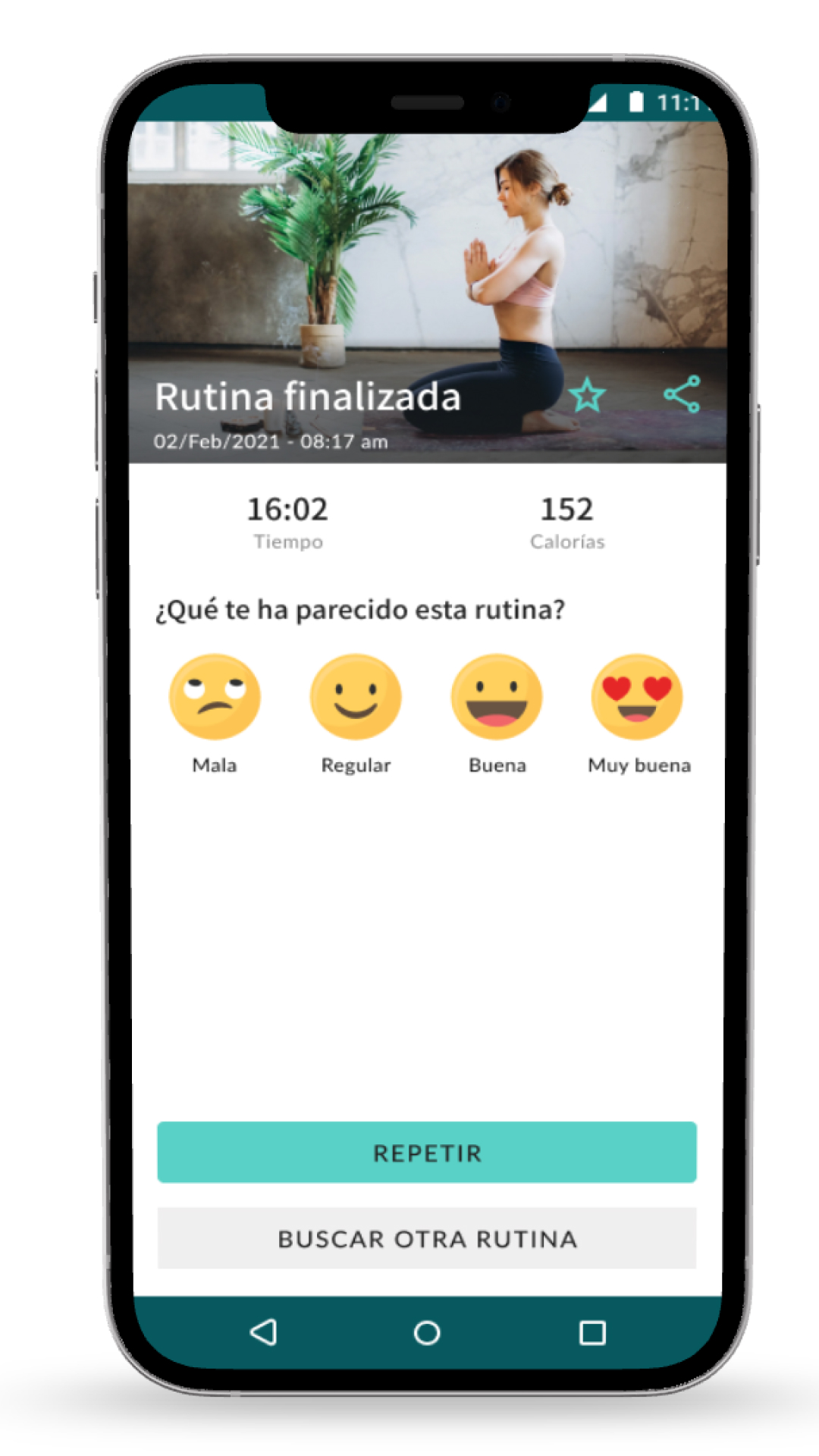
- Research added a new events feature after 87% of card sorting participants grouped local events with core yoga content
- All 15 participants completed the core flows successfully
- 100% found an event in an average of 2.8 steps
- The heuristic evaluation identified help and documentation as the next UX priority
- Within three months of completing Yoggi, I moved into my first formal Product Design role