SpeakEasy Political: Designing for the Power User
A 0 to 1 political ad platform, taking consultant workflows from research to beta as the sole designer.
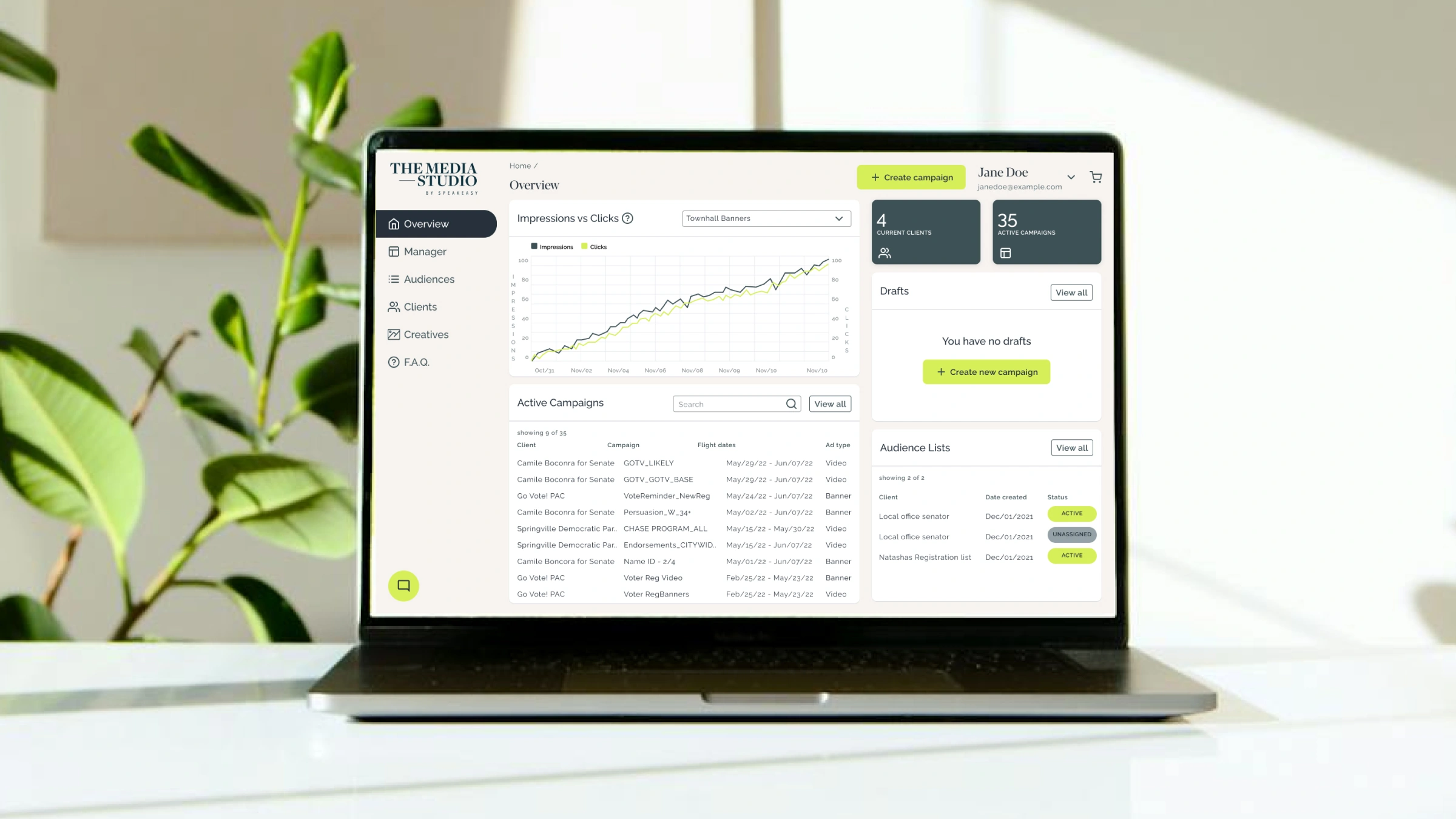
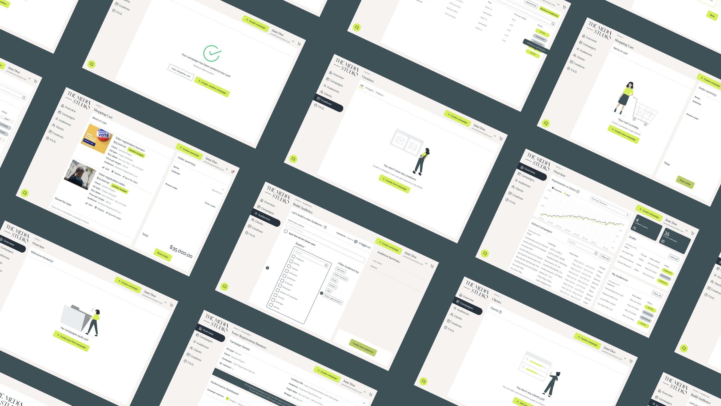
SpeakEasy Political helps political candidates run digital and mail campaigns. The Media Studio was a net new platform built for a higher-value segment: political consultants managing multiple campaigns across different clients.
Designing for consultants who don't have time to learn your product.
Building a new platform, separate from the current product, for political consultants meant starting from scratch: no design system, no existing patterns, and a small cross-functional team. Before anything could be designed, the work itself had to be understood.
Audit first. Learn what worked before replacing it.
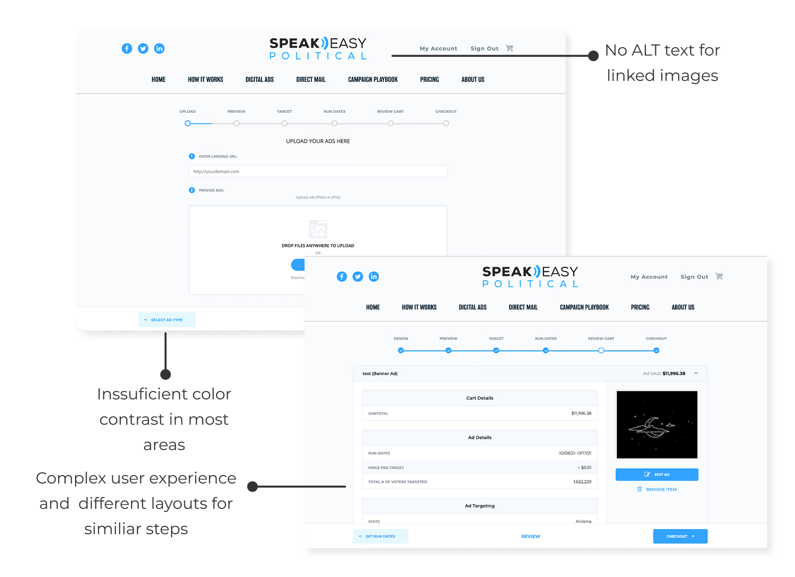
Before designing anything new, I audited the existing SpeakEasy platform for heuristic and accessibility issues.
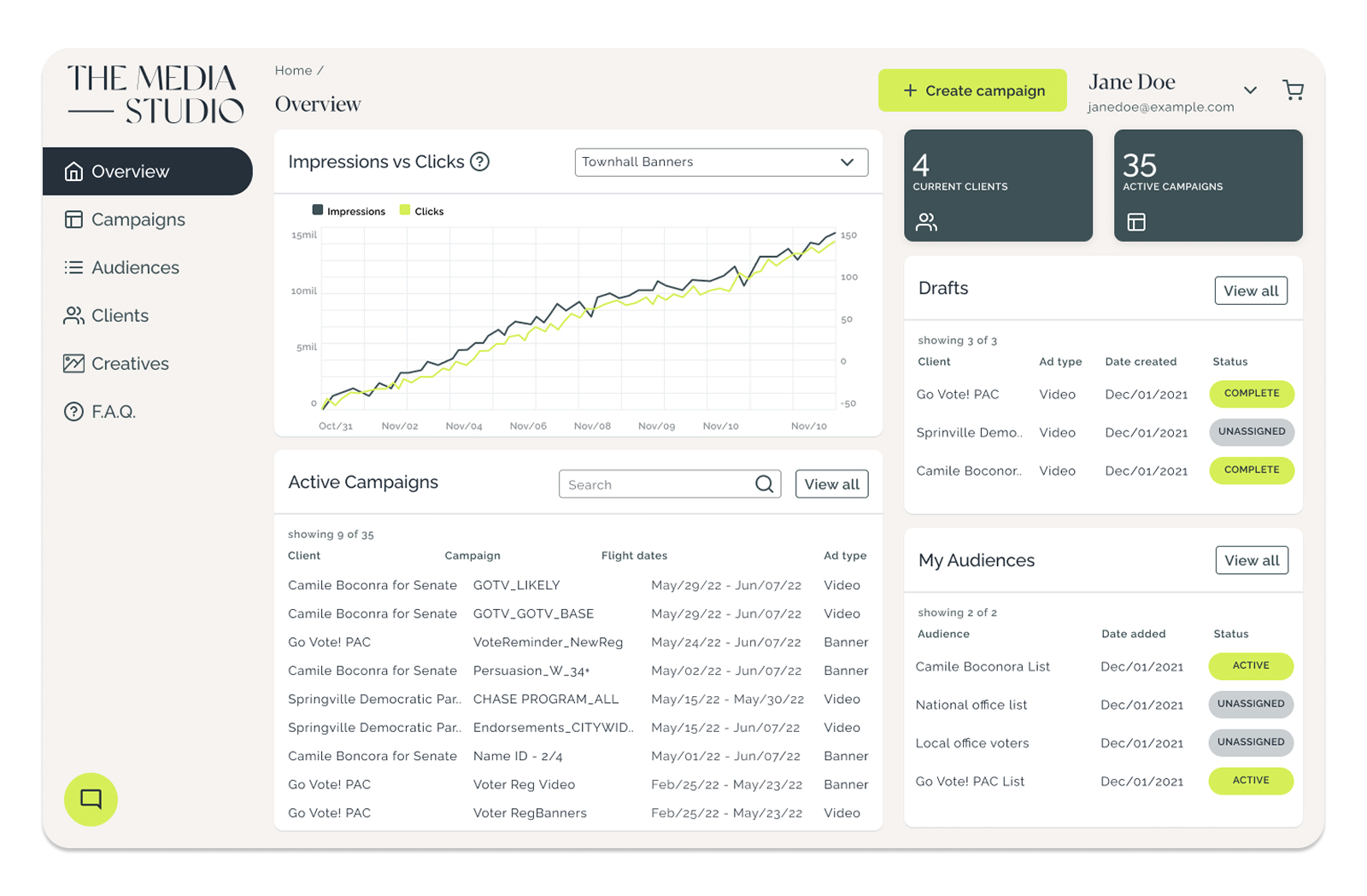
The audit revealed color contrast failures, inconsistent typography, linear workflows that made multitasking difficult for power users, and a homepage that offered little value to consultants managing multiple clients.
The findings gave the business a clear case for a new visual identity. Familiar layout patterns were intentionally carried into the new product to reduce the learning curve for migrating users.
When ownership is real and the brief is incomplete, the work is figuring out the right questions before reaching for the right answers.
Campaigns don't wait for onboarding.
Political consultants operate under real pressure. Campaign deadlines are fixed and users have no time to learn a tool that does not work intuitively from day one. Understanding this user was the foundation everything else was built on.
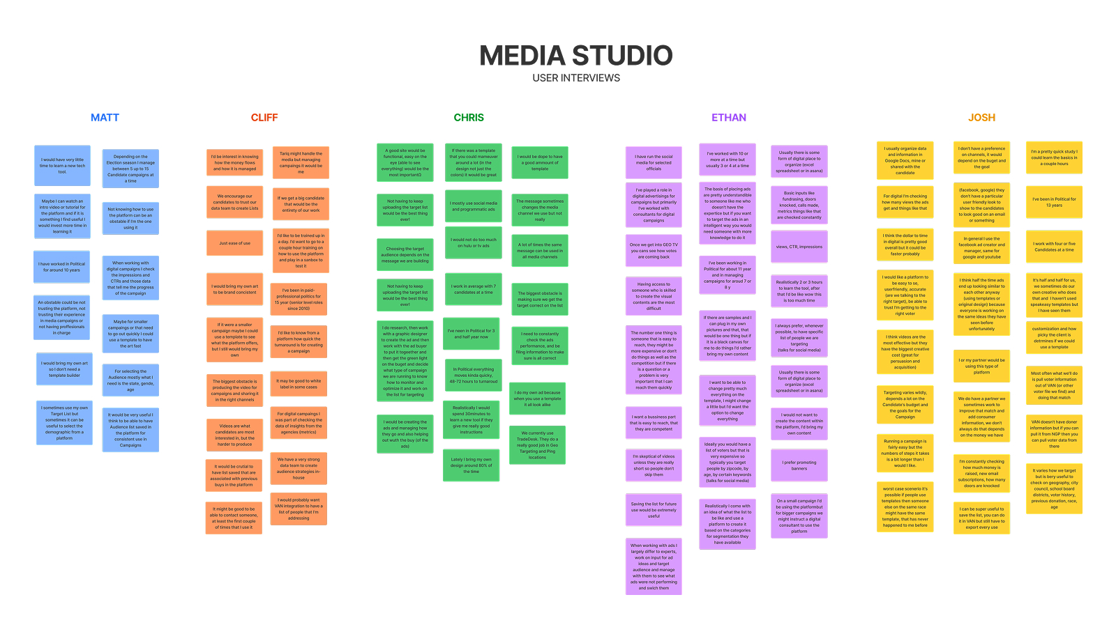
I led three research rounds: persona definition through interviews and card sorting, mid-build usability testing, and a final validation round at beta. Recruiting, scheduling, and synthesis were all handled by me.
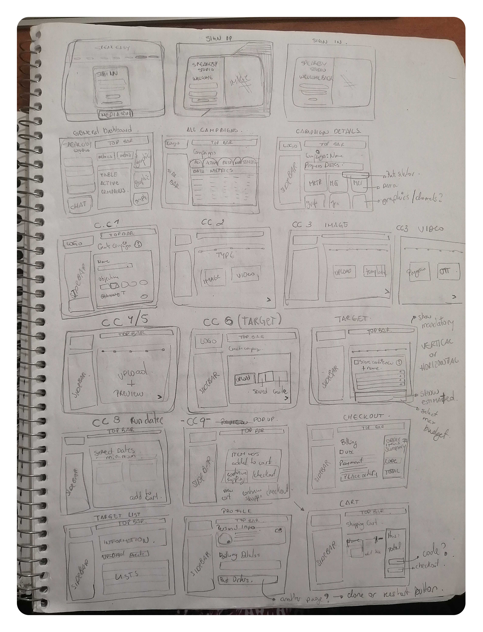
Every screen and flow mapped before opening Figma.
With research complete, the next step was making sense of it all before mocking designs. I mapped the full product by hand: every screen, every flow, and every decision about what this platform needed to do.
Sketching was the fastest way to pressure-test the information architecture and think through the full consultant journey before any high-fidelity work began.
The product and design system evolved together.
There was no design system to inherit. Components were designed, handed off, and built while UX, UI, and development moved in parallel.
To keep the product moving in the right direction, I facilitated workshops with the engineering lead and front-end developer to define MVP scope and prioritize beta features. Design and development stayed aligned from day one.
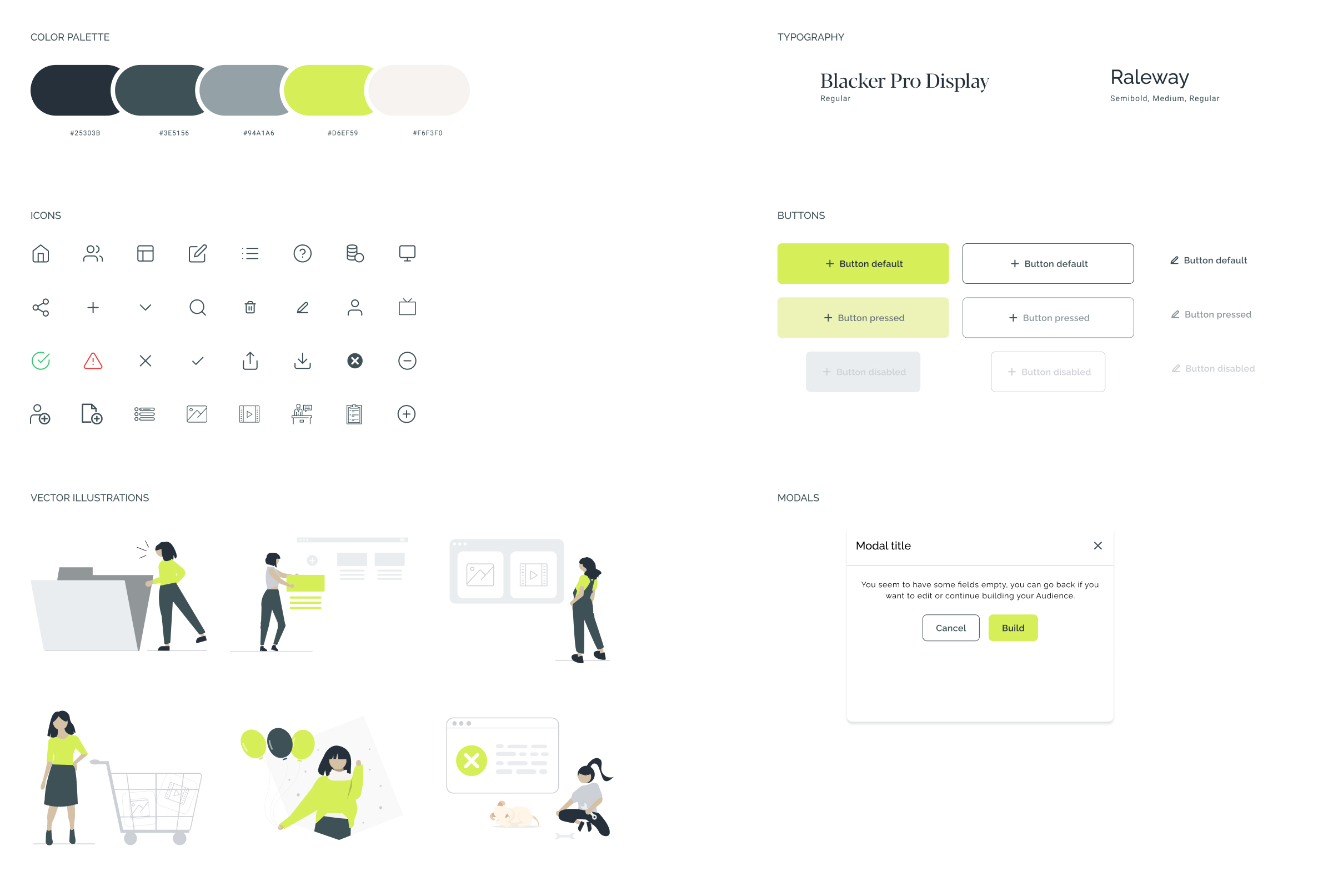
This is one of the most organized handoffs I've worked with, it saved us hours of back-and-forth.
Front-End Developer, SpeakEasy Political
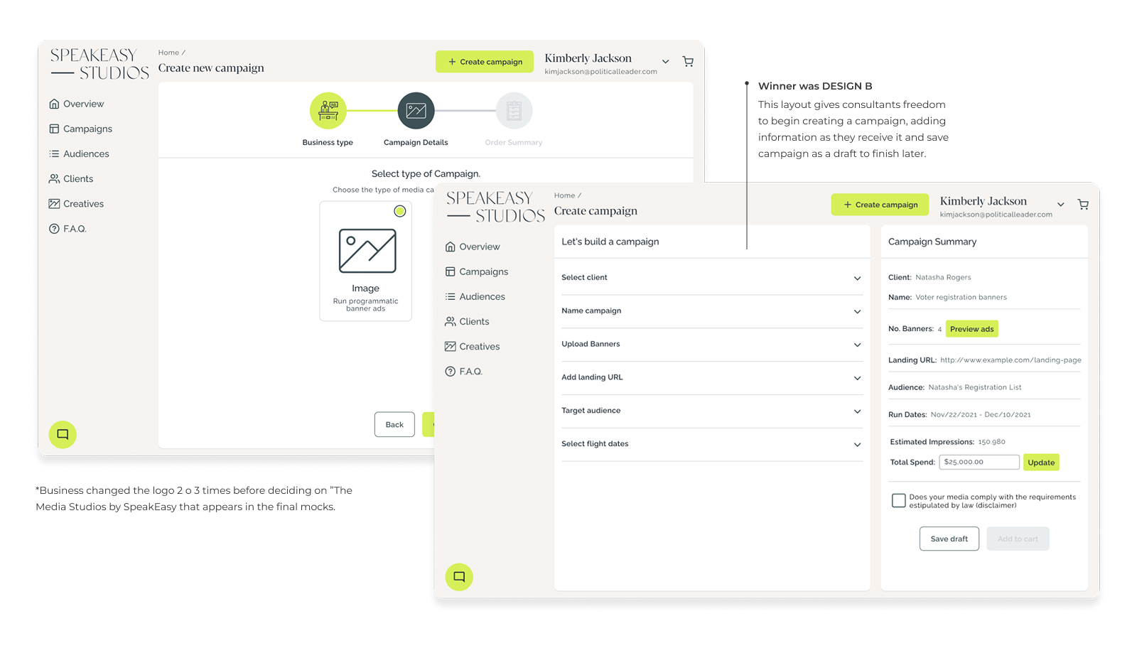
A flexible builder, not a linear wizard.
With the system in place and the team aligned, design moved into the core product experience. Usability testing showed the dashboard needed reorganization to surface the right information for consultants managing multiple clients.
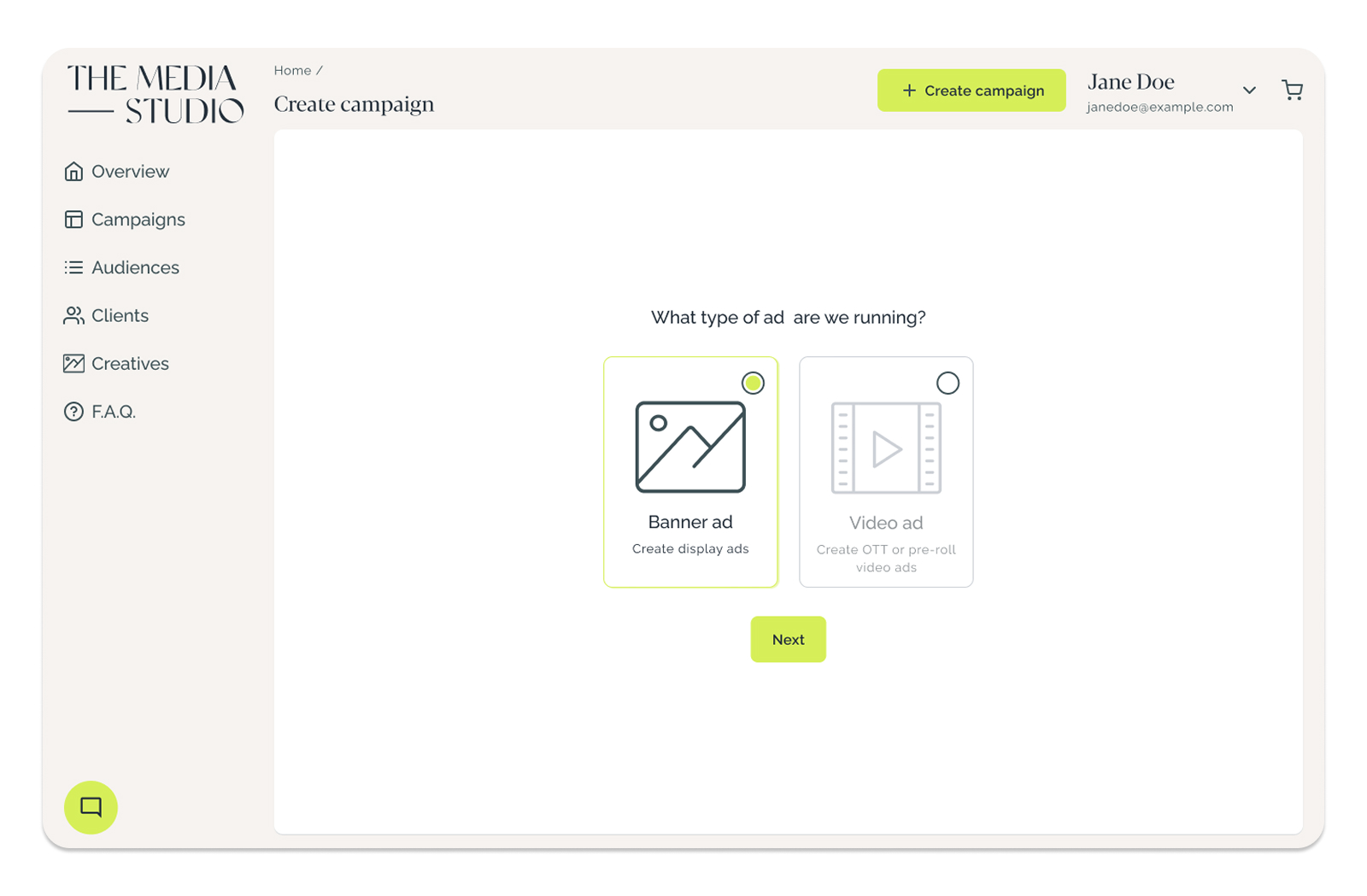
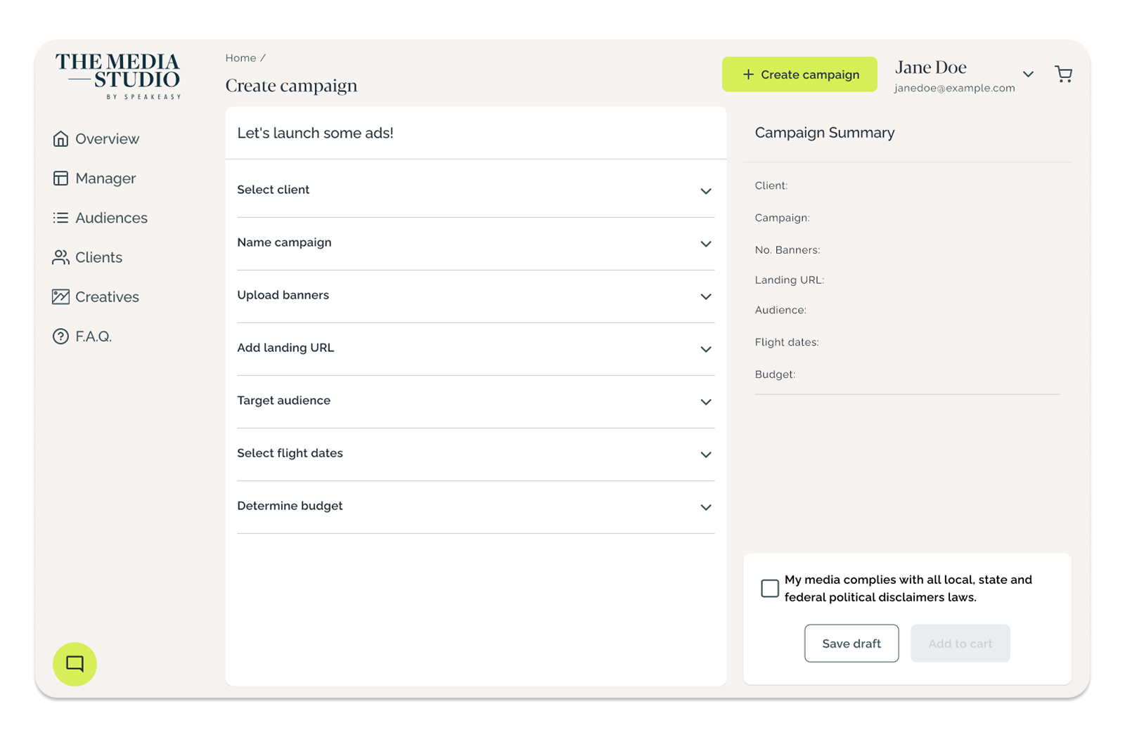
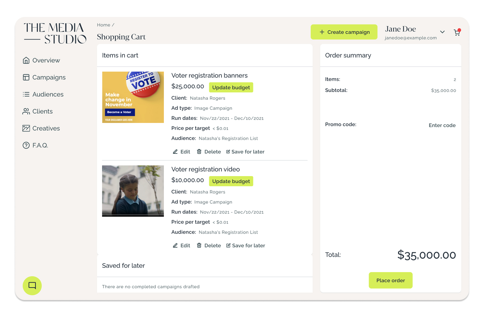
The biggest decision was the campaign creation flow. I proposed replacing the legacy linear wizard with a flexible builder: consultants could add information gradually, save drafts, and return when ready. Testing validated it as the clear winner.
Real adoption from day one.
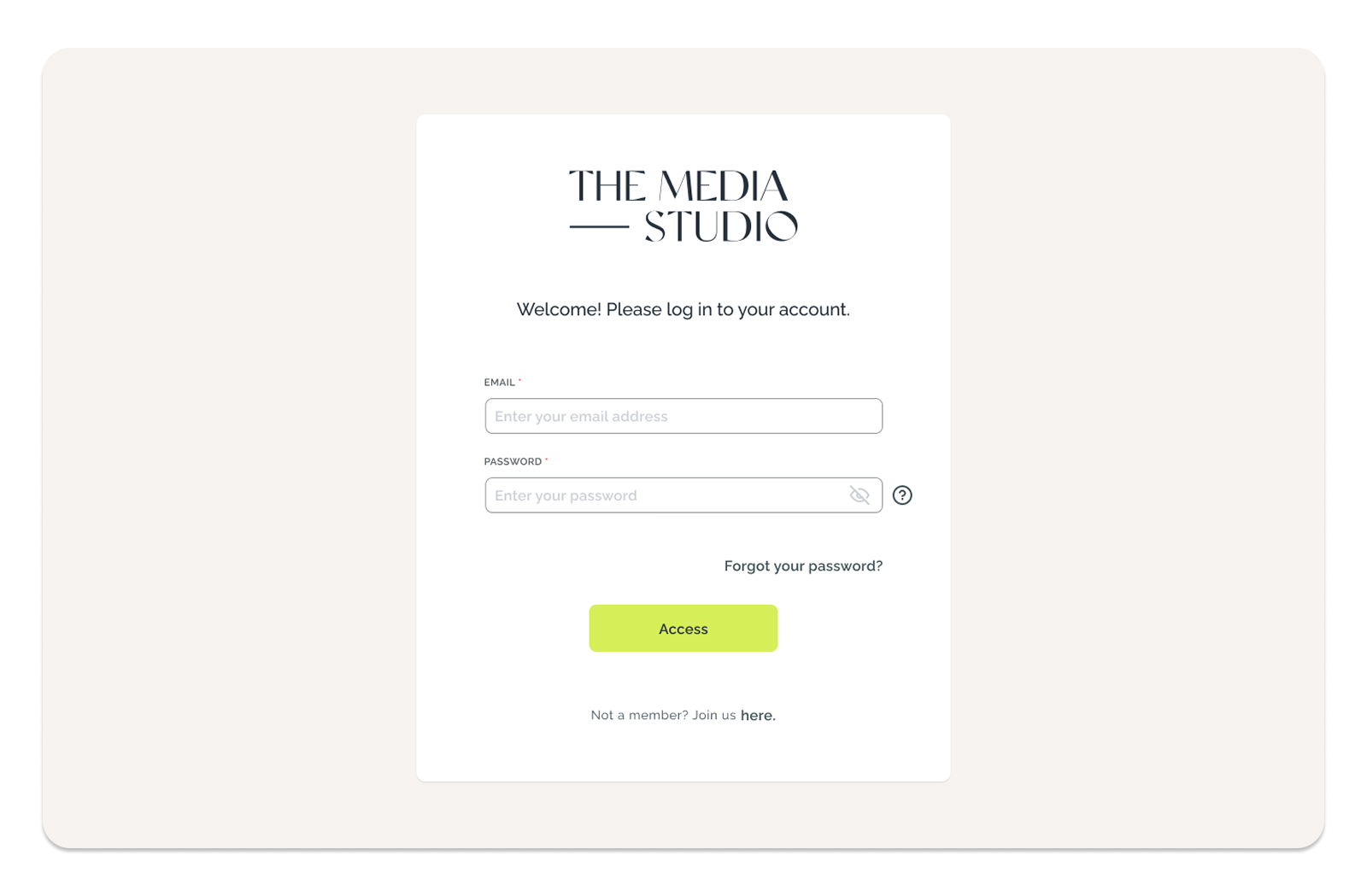
The Media Studio launched in beta in August 2022. Within the first month, the platform had reached 10% of the annual user acquisition target, an early signal that the product was meeting real consultant needs.
The beta marked the completion of a full 0 to 1 design cycle: from audit and research through system building, validation, and ship.
This project confirmed a pattern I have carried into every role since: when ownership is real and the brief is incomplete, the work is figuring out the right questions before reaching for the right answers.
Research is only valuable if you fight for it. Getting budget for multiple rounds was not automatic, but the product was better because of it. Building a design system in parallel with active development is hard but possible with strong team communication and trust. Designing under ambiguity is a skill.